To stay up-to-date with CSS and Tailwind capabilities, from time to time I try to create some components, layouts, and templates, or even recreate something I saw on a website and thought was cool.
It’s worth remembering that on play.tailwindcss.com we only have access to CSS (through Tailwind classes). There’s no access to JavaScript. So any kind of conditional logic, animation, or similar behavior is done purely with CSS.
Without further ado, here are some links to the latest Tailwind Playgrounds I’ve created.
Even though I’m a development team manager, I still do hands-on work (that is: I code). Since I have a lot of information from the business team and also have experience with Design and Usability, I end up creating these playgrounds as if they were MVFs (Minimum Viable Features) for parts of projects I’m currently involved in.
In recent months, we’ve redesigned some areas and components of the website to support the launch of a major product.
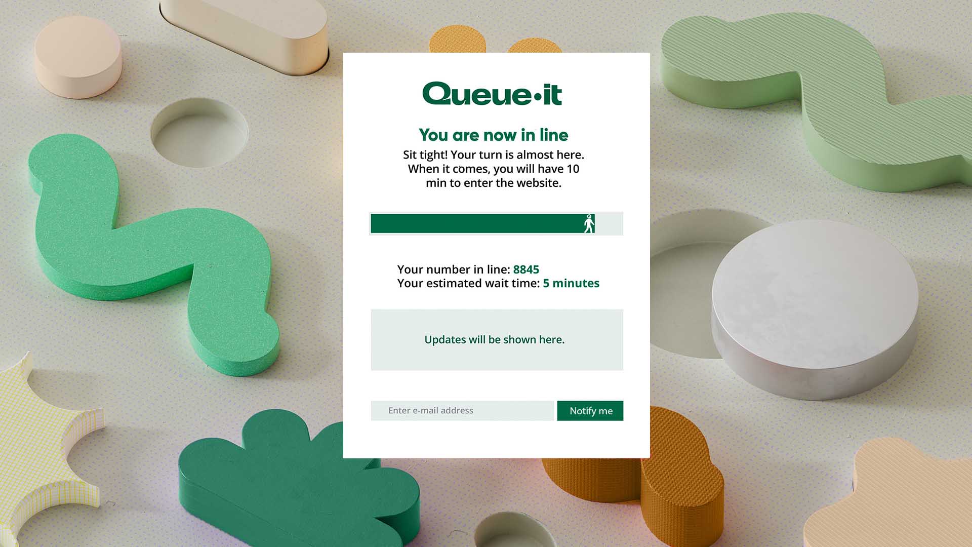
You know when you’re buying tickets for big events or concerts and you often see a page saying “you’re in line and there are 1209 people ahead of you”? The site where I work has a service like this protecting some of our pages.
The default design of the service is very simple and generic, with colors that don’t match the company’s branding. I created this suggestion to better align with the image the company wants to convey, especially during major launches. It also:
When we’re close to finishing a purchase in an online store, it’s common to have a step in the checkout flow where the store shows a summary of the items, your address, your payment method, discounts, and some rules that need to be acknowledged.
The current version already has several adjustments—especially for mobile and tablet—and other components, but it’s not very far from what’s shown in this playground.
The main difference is that the review of what was being purchased, the chosen payment method, delivery method, discounts, and final amounts used to live in a sidebar. With users adding 8–10 products to a single cart, that sidebar became very long. The user had to scroll extensively to see all the information. It also wasn’t easy to identify which products were pre-orders versus those available for immediate delivery.
With products displayed in small boxes and a clear separation between ready-to-ship items and pre-orders, it becomes much easier for users to understand what’s in their cart. The payment section is also clearer and easier to find, as are the applied discounts. We received positive feedback on social media, pointing out that checkout became faster and easier.
Very common in online stores, product cards are components used to present a wide range of information, from image, title, and price to other important details like sizes and colors (for apparel), etc.
What’s currently on the site is also a slightly different version, mainly to accommodate other elements we have. Some of the symbols and badges shown here are slightly different to match what’s displayed on sites in other regions of the company.
One challenge we faced was dealing with the amount of information we need to show on these cards. Here in Europe, due to local legislation, we’re required to display several pieces of information whenever one of these cards appears.
Take the game The Legend of Zelda: Echoes of Wisdom + Zelda amiibo, for example. It includes an age rating, and in the current version we also show certain content descriptors (violence, language, sex, etc.), which takes up even more space on the card. In the case of T-shirts, we have to list all available sizes, and in some cases there can be more than 10 (kids: 92, 104, 116, 128, 140, 152; adults: S, M, L, XL, XXL).
To avoid this situation and reduce information overload, we use logic to check whether there are kids’ sizes and adult sizes. If there are sizes from only one group, we show them all. If there are both, we show “kids, S, M, L, XL, XXL”.
Main navigation menus are among the most important components of any website. That’s also true for the company I work for. The navigation menu was already a mega menu, but we had to make some adjustments due to the major launch I mentioned earlier.
Because of this new product, we had to adjust the hierarchy in one of the menus so it could have tabs inside the mega menu, allowing us to display the links for each tab.
The highlight here is the presence of tabs and the ability to switch content between them without using JavaScript—only CSS/Tailwind. This element still exists on the production site, which helped reduce several lines of custom JavaScript.
In addition to using Tailwind’s grouping functionality, group/ (line 04, for example), we also used two checkbox elements, one for each hidden tab. We then used Tailwind’s peer functionality, peer/ (line 27, for example), so that whenever a checkbox is selected, its corresponding “peer” content appears.
The tab titles are their label elements, and when clicked, they activate the respective checkbox and its peer. Dynamic tabs, without JavaScript!
In an attempt to improve how available payment methods are displayed, I took the initiative to create credit-card-style versions. Knowing that there are other payment methods besides credit cards, I also created a version using small boxes.
The biggest challenge is showing the minimum amount of information needed to know that a payment method belongs to the user, while clearly distinguishing which method is currently selected and which others can be chosen. Personally, I prefer the small-box version (the ones at the bottom of the playground). They take up less space, make it easy to identify which action to take to set another payment method as primary, and avoid unnecessary information (such as titles, masked value characters, etc.).
At the moment, it’s still being discussed whether and when this component will go live. We have other, more important projects to finish, and for now this component sits at the very end of the priority list.
As part of my job, I have to evaluate solutions that might bring some advantage to our environment, even if we already have a solution that provides everything we currently need. While evaluating alternatives for headless CMSs, I visited the DotCMS website and found their navigation menu quite interesting.
Nowadays, their navigation menu still uses a style similar to what I implemented, but without changing content when hovering over each item’s options. I believe they changed it because the number of items in each menu used to be smaller and categorized differently. The menu also maintains different levels of hover overlap depending on the submenu and the element within it that’s selected.
Additionally, when analyzing the JavaScript code they used to achieve the same result, it was clear there was a certain level of complexity. That complexity inevitably resulted in a lot of JavaScript being sent to the user’s browser/device, which we know negatively impacts the overall experience.
Regarding the technique itself, I used multiple groupings with custom naming, nested within each other. I also used group-has-[] to show or hide auxiliary content depending on which subsection the mouse is hovering over.
Another technique applied was using a rule directly in the style property with Tailwind variables. If you look closely, there are some style attributes like style="width: calc(100% - (var(--spacing) * 82))". This allows us to adjust/calculate an element’s width using the --spacing variable as part of the calculation. This approach lets the subsection adapt according to the value of --spacing, which changes depending on the current browser size.
I often browse Dribbble. Even though it’s full of very similar posts, I still find it a good place to discover designs I can try to implement. This playground (and the next one) came from those “incursions” I usually make there.
The element, although simple, allowed me to add some behaviors that usually aren’t available in a static image. In the original image, the stars were always visible. I chose to implement behavior where they only appear when the user hovers over the image card.
Another behavior I added was an animation to the “like” icon (the heart in the top-right corner). When you keep the mouse over that specific element, the heart starts pulsing, as if it were actually beating. Something simple, but for those who notice it, it’s the kind of detail that catches attention and puts a small smile on their day.
Here, I also used Tailwind’s grouping functionality, group/ (line 17), to achieve the hide-and-show effect for the stars. I also used translate and animation via the duration-150 ease-in classes so the stars’ entrance and exit would feel smooth and slightly slower. Nothing as complex as the navigation menus shown above.
This card itself isn’t complicated to create with CSS. By using grids and borders appropriately, we can build it. The background effect—with a duplicated, smaller card border—is very interesting.
In the past, back in the days of tables, floats, and other approaches, I would have recreated this effect using images. For some time now, that’s no longer necessary. By properly using position: absolute and z-index, we can achieve this effect.
The image I originally saw only showed the effect on the left and right sides. I took the opportunity to also create the effect vertically. The mobile version is also well adjusted (from 320px and up).
As we can see, it’s not something complicated to do, but the effect of thicker borders, one connecting to another, creating this sense of depth, is really cool.
Obrigado a todos e até mais.